CodeRabbit is now in the Claude Marketplace!Learn more

Sahana Vijaya Prasad
April 10, 2026
6 min read
April 10, 2026
6 min read
Share
Cut code review time & bugs by 50%
Most installed AI app on GitHub and GitLab
Free 14-day trial
CodeRabbit reviews code across every language, framework, and team size. Solo developers shipping side projects. Enterprises enforcing compliance across hundreds of repositories. That range means a lot of configuration knobs. More than a 2004 Honda Civic dashboard, certainly.
Every setting exists because someone needed it. Path-specific review instructions, tool-level toggles, draft PR handling, labeling rules, tone control. Each one is a dealbreaker for somebody. Remove it and you lose them. Keep it and the settings page grows.
Over time, our settings page became a wall of options that overwhelmed a lot of users — especially those new to CodeRabbit. Here's how we solved it and what we learned along the way.
Before changing anything, we looked at who was using the settings and what they were doing there. Four patterns showed up.
The "just make it work" user. They install CodeRabbit, maybe change the review language, and never come back. They want sensible defaults and the confidence that they're not missing anything important.
The hands-on developer. They spend fifteen minutes tuning things: adjusting the tone, setting up path-specific instructions, toggling walkthrough sections. Then they leave it alone.
The platform team. Enterprises with compliance requirements and standards enforced across every repo. They need access to everything because their use cases are the edge cases.
The "config as code" user. They don't want a UI at all. They want a YAML file in version control, reviewed in a PR, applied automatically. Configuration is infrastructure.
A challenge for our team was recognizing that these weren't fixed user segments. A single user might belong to the "just works" group on Monday and the "config as code" group on Friday.
The obvious fix for settings overload is a simple view with an "Advanced settings" toggle. We tried it, but it didn't work for a couple of reasons.
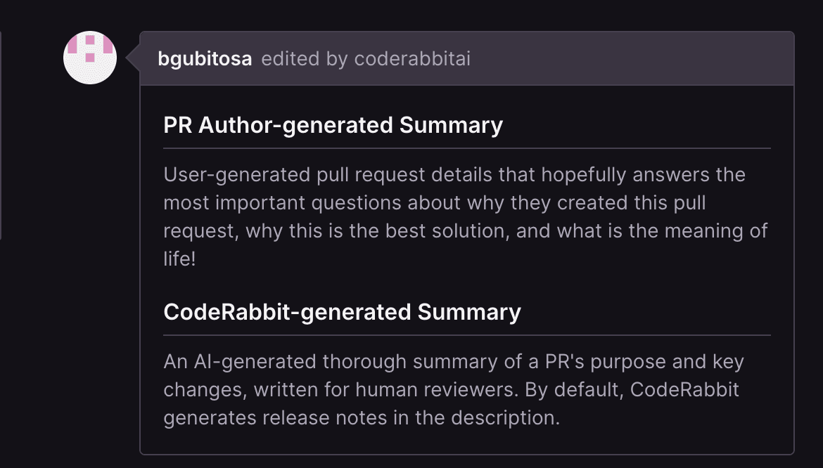
Our settings UI is generated directly from a JSON schema — the same schema that powers every .coderabbit.yaml file across millions of repositories. When a developer adds a property to the schema, the UI renders it automatically, without any additional frontend work. We didn't want to lose that. Bolting "basic" and "advanced" flags onto the schema would have added complexity to the one system we'd kept simple.
But the deeper problem was simpler than architecture. We couldn't agree on what was basic versus advanced. Is "Auto-assign reviewers" a basic setting or an advanced one? For a solo developer it's a niche toggle; for an enterprise team it's a critical workflow.
The basic/advanced split assumes users fall on a single axis of sophistication. Ours don't. A setting that's advanced for one persona is table stakes for another.
Since we couldn't restructure the schema or agree on two tiers, we tried something else: decoupling how settings are presented from how they're stored. We built three views over the same configuration.
All three read from and write to the same data. This shifted the conversation from "is this basic or advanced?" to "do most users need to see this?" without needing to maintain a separate schema.
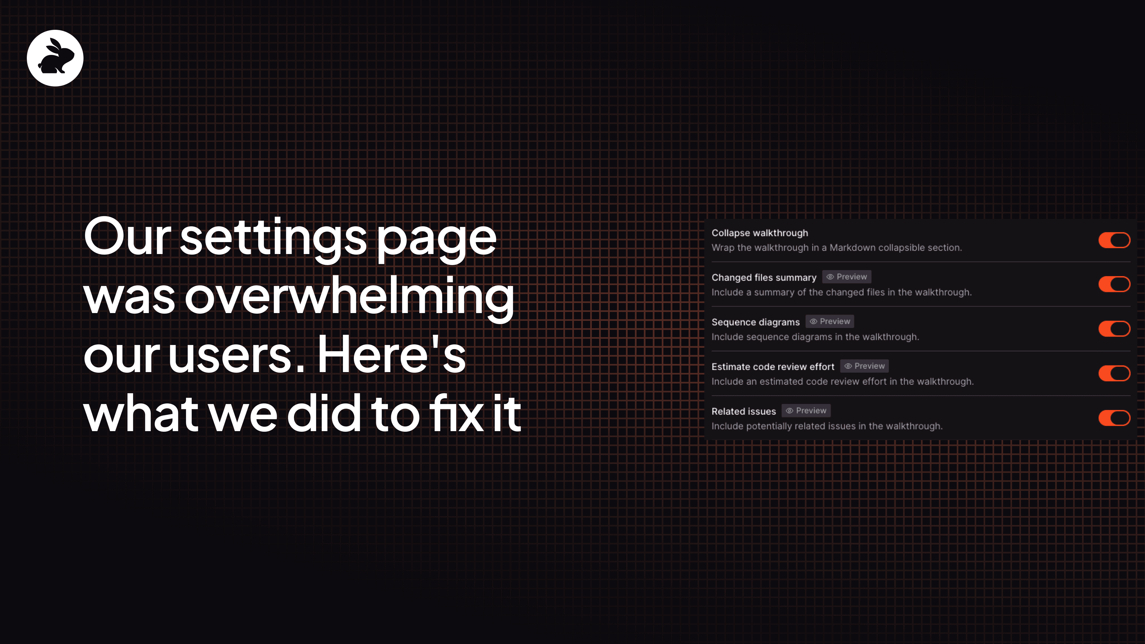
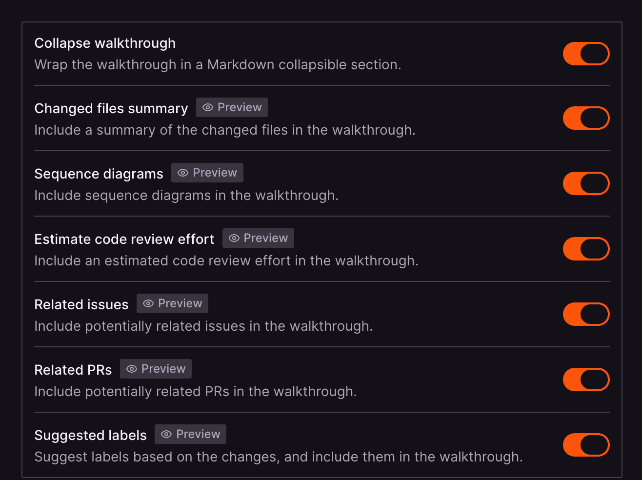
Three views solved the structure problem, but there was a deeper issue: settings are abstract. "Enable sequence diagrams" means nothing if you don't know what a sequence diagram looks like in a PR review.
So we added a live preview panel. It shows a mock PR review comment right next to the settings.
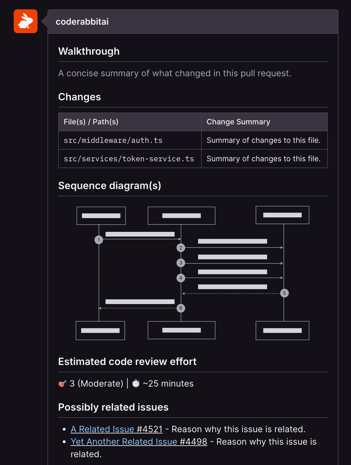
Toggle "sequence diagrams" off and the diagram disappears from the preview. Settings tagged with "Preview" tell the user which ones have a visible effect — instead of configuring blindly, users can see the result before they save.
This solved one of the bigger problems that reorganizing the settings alone couldn't, which is users didn't understand what the settings controlled.
Settings pages aren't glamorous. But get them wrong and every power user you have will feel it. Here are the three things that stuck with our team after this process and how we'll take it into our next redesign.
There's no single right view for all users. A solo developer and an enterprise platform team need fundamentally different things from the same settings page. What worked was giving them different paths to the same configuration and making transitions between them seamless. Someone who starts in Concise and can't find what they need should land in All Settings smoothly — not hit a dead end.
Structure alone doesn't solve confusion. We spent a lot of time on organization and grouping, but the preview panel ended up being one of the most impactful changes, and it had nothing to do with structure. Showing the output next to the input made settings concrete in a way that descriptions never could.
Protect what already works. We could have restructured the schema to make the UI cleaner. It would have broken every .coderabbit.yaml file out there. Keeping the data layer stable and putting the flexibility in the presentation layer let us ship a completely different experience without introducing regressions elsewhere.
Ready to try it yourself? Start your free trial of CodeRabbit.